Creepy Castle: Looks Like Retro!
Creepy Castle: Looks Like Retro
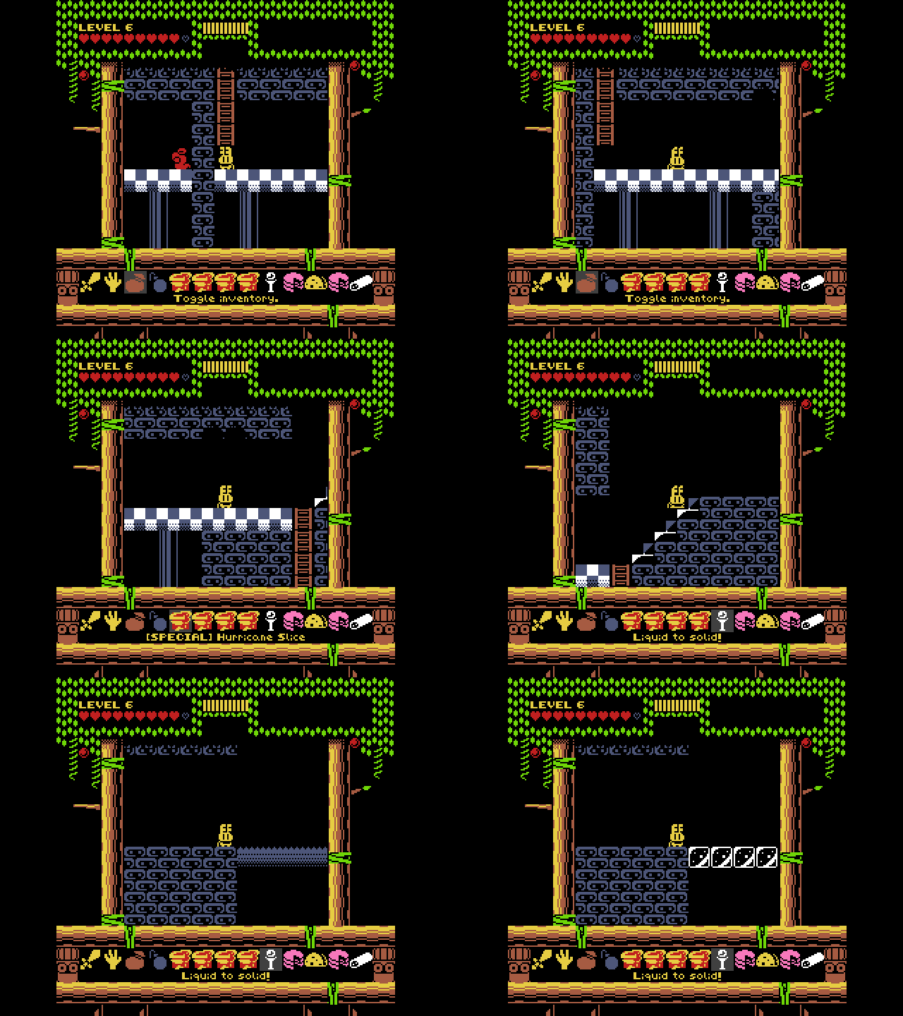
Hi everyone! This is Zach again to talk some more about Creepy Castle. This time I wanted to discuss the visual style of the game. All it takes is one look at a screenshot to notice two things: 1) it has a very low-fi, retro art style, and 2) it doesn't really look like most of the other retro-inspired games that are out there.
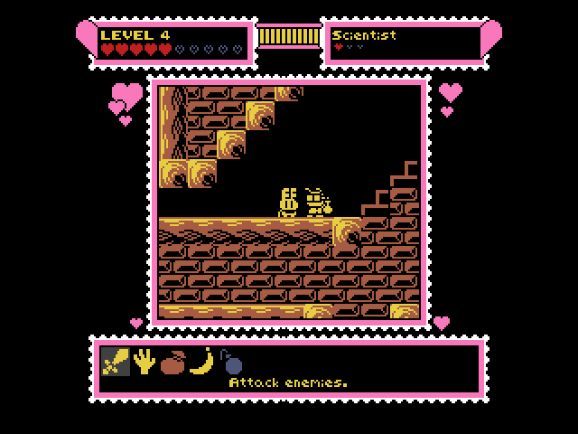
There's something about pixel art that's timeless, huh?
So why the old-school visual design? I guess the answer is simply that I like it. I've always been a fan of retro games and pixel art, so I just went with what I enjoy! Unlike a lot of pixel-art game creators, I didn't want to go for the look of any specific classic game hardware, so I didn't try sticking to an NES color palette or anything like that, but I did get a lot of inspiration from the Japanese MSX computer, as well as the ZX Spectrum and Commodore 64. Even though the visuals weren't directly informed by classic hardware restrictions, I did set one rule for myself to try to create some visual cohesion: only two colors for each eight-pixel-by-eight-pixel tile, which tends to give the game a somewhat monochromatic appearance. If you look closely you'll notice I break the rule occasionally, but I think I did a pretty good job of sticking to it most of the time, and only bending the limitation on tasteful and hard-to-catch occasions. Influence from old PC games is also one of the reasons why most of the game takes place against a black background; the other reason for all the black, of course, is that most of the game is set in dark dungeons and caves and the like.
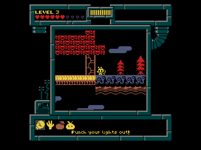
The game's look isn't based on anything specifically, but the MSX and ZX Spectrum were big influences.
Another thing you'll likely notice right away is that the window for the playable action- the viewport, if you will- is somewhat small compared to the size of the entire screen. Technically, there's not really any strong reason for this either, but it's just something I remember fondly from classic games like Dragon Slayer, Xanadu, and other Falcom classics (as well as Commodore 64 games like The Last Ninja). These old games would have a window for the gameplay, accompanied by separate windows alongside it containing various information, and I wanted to include an homage to that, in addition to simply enjoying the aesthetic.
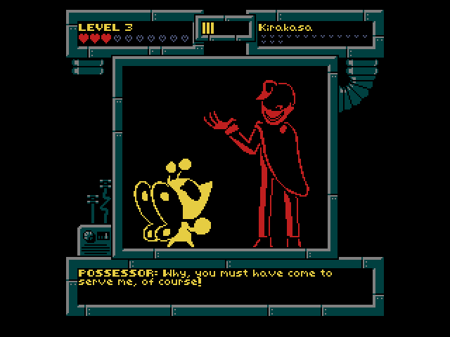
The smaller gameplay window is a throwback to classic action-RPGs like Dragon Slayer.
To be honest, this is probably the most I've thought about the game's look since I started making it. For the most part, I just went for what felt right and it kind of happened naturally. I'd like to think it's a lot like the early days of game making when developers were never afraid to be experimental and pretty much anything was OK, even if it was totally crazy. These days things tend to be a lot more homogenized, especially when it comes to larger publishers, but I think there's a lot to be said for doing something a little different that stands out from the crowd.
Of course, if there are some things you don't like about game's the visuals, there are ways you'll be able to customize its appearance, but I'll get into that more in a later post.
