Creepy Castle: Custom Creepy!
https://youtu.be/Vj_lVOokdU0
Hey guy, this is Zach again. I've talked a lot about the content and features in my previous updates about Creepy Castle, but this time I wanted to touch on something that isn't really directly related to the gameplay: the customization options. If you checked out our Kickstarter campaign, you may recall that a customizable interface has been one of the planned features ever since the beginning: you can completely change the border around the gameplay window and choose between hearts or a bar to represent your life meter. In addition, you can select from multiple color palettes.
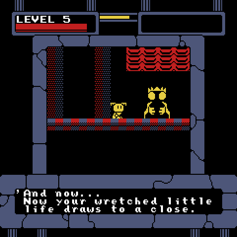
This is pretty much how the interface looked when we first designed it.
It might not seem like a huge thing, but I honestly think that having multiple borders is a great way to make the game better suited to the player's personality. In the beginning, of course, there was only one type of border. But then it went through revision and redesign, and the new interface looked quite different from the original version. I showed it to my friends, and opinions were mixed. Some liked the old one, and some liked the new one. Some preferred the hero and enemies to have their remaining health displayed as a somewhat nebulous bar, while others preferred seeing it as distinct hearts so it was a bit more obvious how much health they had left. It seemed to be a simple matter of personal preference. So I figured, what the heck? Why not include all those options and let the player decide which to go with?
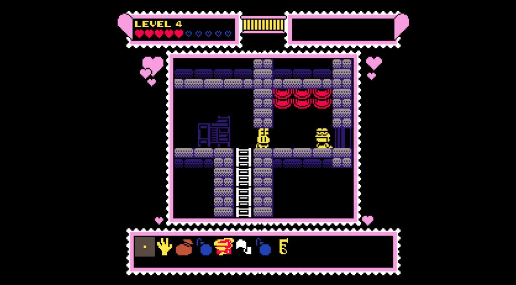
Do you prefer the old look or the updated look? Either way, you're good to go.
The custom interface choices grew from there. You can select from one that's red and smooth, one that's blue and stony, one that's grey and mechanical, one that looks like castle parapets with dragon heads breathing fire, one that looks like a lush forest, and others. There are currently nine border choices in the game, but that could end up expanding before the game's release.
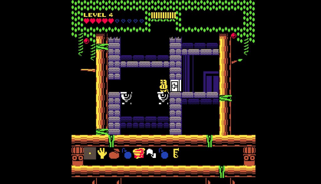
This plant-themed border is pretty soothing, don't you think? It's one of nine you can choose from.
The customizable color palettes came about during the Kickstarter campaign. One of the stretch goals (which we hit) was to include a greenish four-color Game Boy-style palette for the game, so to do that I implemented a shader that can swap certain colors with other colors. Once the shader was done, it was no problem at all to include other alternative palettes as well, and the number of color options has currently climbed to 10 (though, as with the borders, the number may grow).
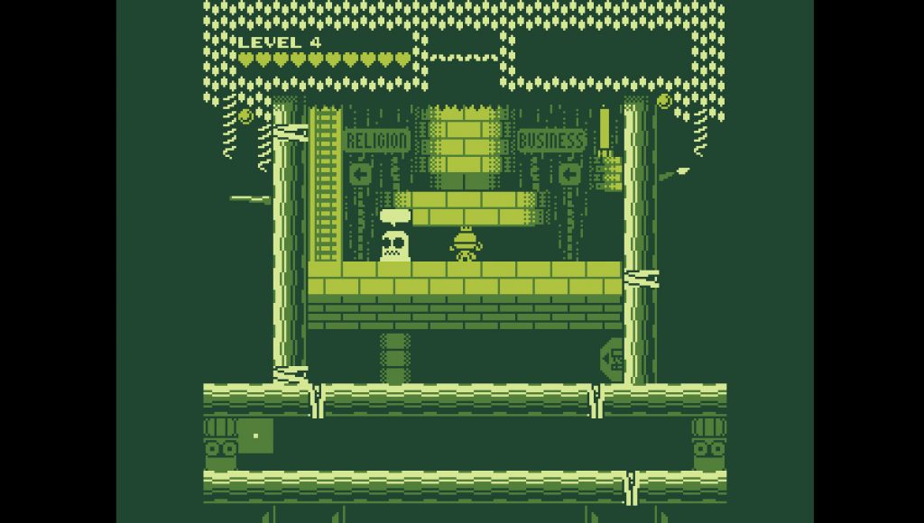
It's like 1989 all over again with the Game Boy-inspired color palette!
You can choose to go with a brighter color palette, a more muted palette (if you find the default palette tough on the eyes for any reason), a grayscale "noir" palette, a pastel pink palette, a black-and-white palette, and even an NES color palette. There's also one that makes all the colors weird - it was sort of inspired by Super Mario World, specifically the way the colors and character art would change once you cleared all 96 exits in the game. Sorry, no pure-red Virtual Boy color scheme though!
On top of all that, there's also even more adjustable shader options that let you tweak the game's aesthetic to your liking. All of the aforementioned options from this update are available from the get-go - you don't need to unlock them or anything - so I hope you enjoy trying them out and finding your favorites once you play the finished game.
